Last year, I visited Alcatraz on a trip to San Francisco. When walking through “The Rock”, I couldn’t shake the eerie feeling of sharing the same surroundings as notorious criminals like Al Capone. It came to life around me as I followed the Cellhouse Audio Tour, a self-guided journey narrated by 4 former officers and 4 former inmates. Here’s a clip:
The guard narration, interviews, sounds, and reenactments were incredible. I vividly remember the 1946 escape story dubbed the ‘Battle of Alcatraz’, tracing the route the prisoners had taken, touching the widened bars that gave entry into the gallery, and feeling the pock marks on the floor from the Marine grenades. It was a surreal experience, and I would go back again in a heartbeat.
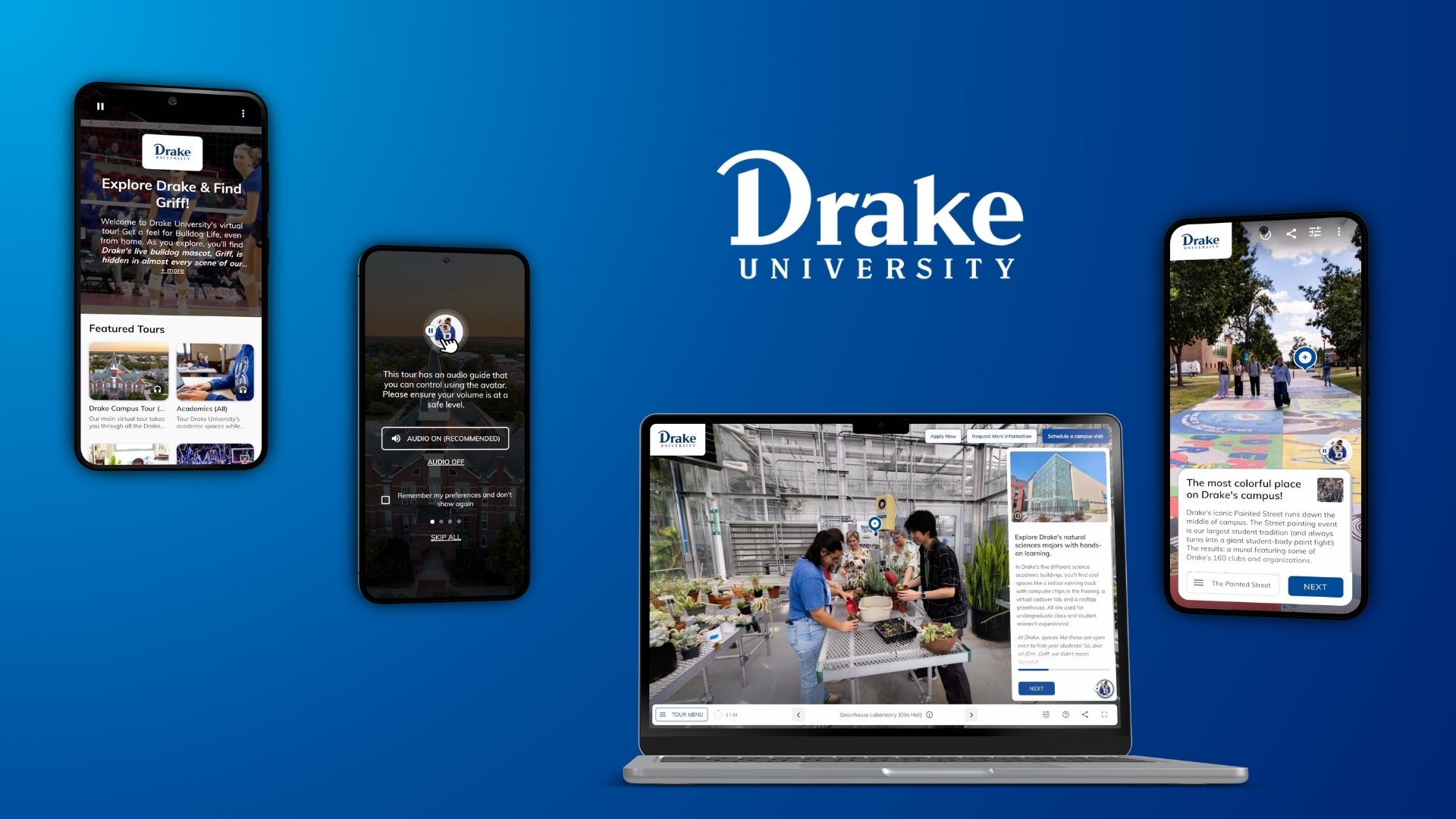
After the Alcatraz tour, I realized how far behind digital experiences are in replicating the visit I had. For me, this hit incredibly close to home — over the last several years, my company has built and launched hundreds of virtual tours for brick and mortar venues like campuses, theatres, museums, and fitness centres. I’m proud of the work we do. It’s obviously unrealistic to expect a website can replicate an in-person tour, but I wondered, did the gap really have to be this wide?
I researched the underlying problems by visiting countless virtual tours from around the web, and interviewing both clients and end users. I encountered hurdles like slow and glitchy content loads, audio and video that blasted on page open, controls and icons that were tough to decipher. All tours began with a noble intention of crafting a smooth walk-through experience, however I frequently ended up disoriented, lost, and frustrated. And I wasn’t the only one.
For marketers at brick and mortar venues, the consequences are real — a lacklustre first impression, a deflated view of the brand, and being pushed to the bottom of the “must visit” list. With incredible computing in the palm of our hand, how did things get to this point? After thoughtful deliberating I narrowed it down to three major pain points:
- Confusing user interfaces
- Outdated code and content
- A missing story line
Using field research and interview feedback, as well as hands-on insights from real projects, I’ll summarize these 3 areas in more detail, and the steps needed to fix them.
Pain point 1: Confusing user interfaces hide what you’re looking for
88% of online consumers are less likely to return to a site after a bad experience.
Gomez Report, Why Web Performance Matters
The job of any tour is to serve up what is most important and relevant to each visitor, and point out other interesting or valuable content along the way. However, most virtual tours adopt a one-size fits all approach in assuming all visitors have the same needs and web proficiency. There are a few consequences to this. The first is that they present the entire list of content to those seeking something specific. The student interested in athletics wants to see the running track, the field, and the pool; the senior with a creative side is looking for gardens, a greenhouse, and an art studio. A responsive tour guide would bump those points of interest higher on the list and spend more time at those stops. The second consequence is that they overwhelm users with complex navigation, mystifying icons, and menus within menus to click through. It’s a steep learning curve, and most users aren’t willing to weather through it (why should they have to?). When the interface misses on offering simple, intuitive controls, these problems pervade the entire experience and frustrate users, forcing them to exit.

Pain point 2: Outdated code and content limit the experience
85% of adults think that a company’s mobile website should be as good or better than their desktop website.
SEOCIAL, Why Responsive Design is Important: 10 Key Statistics
From loading issues to broken virtual reality buttons, the glitches present in many virtual tours are not easy to look past. As soon as a tour project goes live, the code is challenged in unexpected ways as new devices, technologies, browsers, and user behaviours emerge over time. The biggest offender I noticed in this respect is the absence of responsive formats for smaller displays, in a time when users are spending over half of their nearly 6 screen hours per day on mobile (KPCB Internet Trends). In many cases, desktop interfaces were displayed on mobile, making touch targets and buttons way too small to be activated.

On the content side, for larger venues there is ongoing work to keep a virtual tour updated and relevant, such as adding new media and new locations as the venue expands or re-purposes spaces. Every time there is an improvement in the location, the tour should improve as well, right? The new dance studio at the gym, the new suite at the retirement center, a renovated dining area… often those new spaces get left out to avoid engaging an external vendor or adding to the IT team’s “when we get around to it” list. Without a streamlined workflow in place, updates fall by the wayside, and visitors miss out on new investments.
Pain point 3: A missing story line
This is a big one. Today’s virtual tours feel like a hasty, uninspiring tour guide — they show us a list of places, but they don’t deliver any sort of memorable narrative or storyline about why. They fail to capture our imagination.
Resolving the challenges
What does it take to make beautiful, interactive and easy to use experiences, that cater to the interests, preferences, and web proficiency of each visitor? We know it’s possible; Google has launched several incredible experiences like Inside Abbey Road Studios, Night Walk in Marseilles, and El Capitan, Yosemite. What you’ll discover after viewing these examples is that you are much more eager to visit these places in person. What can we learn from their approach?
Achieving better UI design
“Most people make the mistake of thinking design is what it looks like. It’s not just what it looks like and feels like. Design is how it works.”
Steve Jobs
Addressing UI challenges requires applying usability practices throughout the entire design process. For virtual tours, here are some important considerations:
- Establish design language that is familiar to your users, such as previous/next buttons and menu icons that are obvious how to move from one scene to the next. Make it obvious how to get to the next location.
- Keep important functionality on screen, and relegate the less used controls to menus.
- Put menus in a clear and accessible position, and group places together according to proximity (e.g. “Building A”), or themes (e.g. “Highlights for food lovers”).
- Make next steps easy to find(e.g. book a visit, ask a question, get in touch)
- Make overlay screens simple to close out to return to the main path, using appropriately sized targets for smaller displays, click-outside-content to close, and obvious keyboard controls such as the “Esc” key.

- Keep arrows and chevrons to a minimum, as these can get overwhelming when attached to multiple functions (especially with 360° media present).
- Use high resolution images and photography, since people expect this and today’s devices are using higher pixel count screens that will render high quality media.
- When using different media formats like 360° images and video, still photos, video, text overlays, and audio, make it obvious how to interact with each one using tooltips and guides, obvious play buttons, and simple tutorials.

Rigorous testing
“Do not seek praise. Seek criticism.”
Paul Arden, Creative Director, Saatchi & Saatchi
Delivering a great experience requires refining designs with real user insights. It’s about executing a thorough testing plan to ensure the kinks and bugs are uncovered and addressed. A basic testing plan looks like this:
- Hallway testing designs. Put high fidelity designs (not completed code yet, that’s step 2!) in front of new users and give them a list of tasks to complete. Ask them to walk you through how they would go about completing these, using questions like “is that what you were expecting to happen?”. Avoid the urge to guide them, simply record their actions and feedback. This will help you gather initial instincts and data on how they interact with your site and interpret the components. It will also flag points of confusion or complexity. According to the Nielsen Norman Group’s study, the magic number is 5 users. Synthesize insights and rework your designs as necessary, and repeat if there are material changes.
- Hallway testing early code. Repeat step 1, this time using the coded version. Repeat as needed, testing with new users who haven’t been exposed to your site.
- Cross-platform testing. There are thousands of device/operating system/browser combinations. Solutions like BrowserStack can help you view and use your site through multiple browsers and devices, to avoid bugging everyone in the office once again to test on their smartphone. For detailed info on that topic, check out this article.
- Launch and monitor. After your site goes live in the wild, it’s helpful to keep an eye on it as new devices and browsers are launched to ensure a consistent experience. Google Analytics data can uncover use-case specific issues (such as abnormally high bounce rates on a particular browser).
The power of a story
There’s always room for a story that can transport people to another place.
J.K. Rowling
Prezi offers a poignant infographic about how we interpret and consume content:

Visuals. Stories. Interactions. Could there be a more fitting way to narrow down the key ingredients to crafting engaging virtual tours? Since the visual piece is checked off with eye-catching media, and interactions are a deeper topic for another post, let’s focus on stories.

Amazing virtual tours weave together a collection of stories. Watch street artist Remy Uno paint a mural in a Marseilles back alley at 2am. See the microphone King George VI used to announce the declaration of war in 1939. Perch on the 350m high ledge that rests climber Alex Honnold for the night on El Capitan. These are the stories found inside best-in-class experiences. Of course, not every venue has such unique cultural details, but all will have interesting stories to share if you dig deep enough. The point is that telling the right stories and curating different paths for your users will generate better outcomes (and deeper exploration) than just showing them a laundry list of locations.
By crafting engaging and personalized story lines, you allow people to experience places vicariously through the accounts of others, and they feel genuine. They provide answers and enable visitors to imagine what their own experience could be like. They ditch an exhaustive checklist of places in favour of a curated, personalized experience. When done right, it results in greater engagement, interest, and intent to take action — they connect and convert visitors to the next step.
Here’s the playbook for acing this last step — 3 actions to check off:
- Know your audience. Make a list of audience personas that you are creating for. What are their objectives? What questions do they ask when on site? What content is most valuable to them? What actions do you want them to take after viewing the tour?
- Let people in the thick of it craft the story. This could be your venue staff, tour guides, communications team or social media. Those who are in the spaces everyday and know the questions people are asking will have the best perspective on prioritizing content.
- Define the stops on the tour and provide context for each. Plan out what content is needed to showcase your venue. Think about the locations (stops) that you want to feature, content that supports each one, and timing of production for the greatest impact (e.g. a restaurant at night). For a banquet hall, show images of different configurations of table layouts from weddings and functions, and explain details about each stop. For a college campus, collect video, student work, and testimonials for specific programs. Present related content together, along with a short story to explain what it is and why it’s important.

Wrapping up
I’ve come to realize that locations have emotional significance because they are tied to life experiences. The impact of my Alcatraz visit was that I tell everyone visiting San Francisco it’s a must see. This concept holds true for campuses, museums, wedding venues, and many more places. When built right, a virtual tour elicits an emotional response. It invites us in by exposing narratives and meaning that surrounds us, opens the doors and conveys stories and history present in the bricks and mortar. In the process, it connects with people, and brings a place to life.
Want to talk virtual tours or marketing your venue?
Get in touch with your thoughts and ideas at andrew@beyond.works
Grateful for your 👏 and 💬 as this is my debut on Medium! Shout out to my co-founder Jordan Teichmann for the contributions and edits 🙌